When I worked as a visual merchandiser, I learned that color — specifically, the lack of it — was the single fastest way to make a rack of budget clothes look like a high-end boutique. I would group garments in tonal neutral families: all the creams, sands, and oatmeals together, all the charcoals and soft blacks in another section. Customers gravitated toward those displays. They bought more. And the reason was simple: neutral colors look more expensive, they mix effortlessly, and they flatter almost every skin tone without trying too hard.
If you have ever felt like your closet is full but nothing goes together, the problem is probably not the pieces. It is the palette. Here is how to choose and combine the right neutrals for a wardrobe that feels calm, polished, and endlessly wearable.

Why Neutrals Read as More Expensive
There is a psychological reason neutral-heavy outfits look richer. Bright colors and loud patterns draw attention to themselves. Neutrals draw attention to the silhouette, the fabric texture, and the way clothes fit your body. When an outfit is built from quiet, tonal shades, the eye moves smoothly without interruption. That smooth visual journey reads as elegance.
This is not an opinion I formed from personal preference. It is a strategy I used on retail floors to sell more clothes, and it works on your body exactly the same way. A beige blazer and oatmeal trousers look intentional. A red blazer and purple trousers look like a choice you have to explain. The difference is clarity.
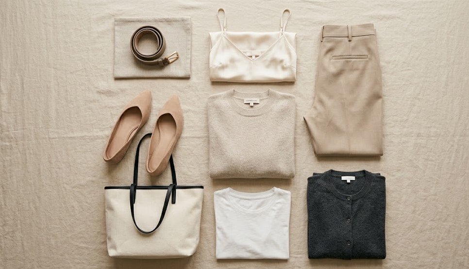
The Neutral Shortlist: Which Shades Actually Do the Work
Not all neutrals are created equal. Some lean too cool and wash you out. Some lean too warm and look muddy against certain skin tones. After years of dressing clients and styling mannequins, I have narrowed it down to a core set of shades that work across body types, budgets, and seasons. These are the exact colors I reach for first.
Neutral Shade | Best Used For | Why It Always Works |
|---|---|---|
Soft White | Tees, shirts, and layering pieces | Brightens the face and acts as a clean canvas for everything else. |
Oatmeal | Sweaters, cardigans, and knit layers | Warmer than stark white, softer than beige. Flatters most skin tones. |
Warm Sand | Trousers, skirts, and lightweight jackets | A natural bridge between light neutrals and deeper earth tones. |
Heather Grey | Knitwear, t-shirts, and casual layers | Adds depth without heaviness. Pairs beautifully with black, white, and denim. |
Taupe | Structured pieces like blazers and tailored coats | The most versatile “not quite brown, not quite grey” shade. Looks expensive on any fabric. |
Olive | Trousers, jackets, and utility pieces | Functions as a neutral but adds quiet personality. Pairs with every other shade on this list. |
Soft Black | Trousers, belts, shoes, and evening layers | Less harsh than true black, especially near the face. Charcoal or washed black are excellent alternatives. |
These seven shades form a self-contained color ecosystem. Any piece in any one of these shades will coordinate naturally with any other piece from the same list. You do not need to think about matching. The palette does the work for you.

The Three-Way Mix Rule I Use When Getting Dressed
Wearing all one neutral shade is beautiful and elongating. But if you want a little more depth without introducing loud color, use what I call the three-way mix: one light neutral, one mid-tone neutral, and one deeper anchor piece.
For example: a soft white tee (light), oatmeal trousers (mid-tone), and a charcoal cardigan (anchor). Or a sand-colored blazer (mid-tone) over an olive dress (mid-to-deep), with oatmeal flats. The variations feel layered and interesting, but the overall palette stays cohesive. This is how you avoid looking bland while still keeping the expensive, pulled-together feel.
What to Avoid When Building a Neutral Wardrobe
Some neutrals sneak into your closet and cause quiet chaos. Bright optic white can feel stark and clinical against warmer skin tones. True black near the face can drain color from cheeks and emphasize shadows. And cool-toned greys often read as corporate and sterile when worn head to toe. If you love these shades, push them away from your face or mix them with warmer neutrals to balance the effect. A black trouser with an oatmeal sweater always looks better than a black sweater with black trousers, unless you are intentionally going for a monochrome evening look.
How to Add Just Enough Color Without Breaking the System
I am not against color. I am against buying a bright piece that only works with one outfit. If you want to introduce color into your neutral wardrobe, choose shades that behave like neutrals: dusty blush, rust, soft olive, muted navy, and faded lavender all sit comfortably alongside the core neutral palette. They add interest without demanding their own separate section of the closet.
Start small. A rust-colored belt, a dusty blush tee, or a pair of navy suede flats will integrate seamlessly into the neutral system you have already built. You will actually wear them, which is the entire point.
Your Weekend Closet Edit
You can test everything I have written here in about twenty minutes this weekend. Open your closet and pull out every piece in a bright, jarring color or a loud print. Push those to one side temporarily. Now look at what remains: the creams, the beiges, the greys, the olives, the soft blacks. Group them by shade. You will likely notice that the remaining pieces naturally look more expensive and mix more easily. That is not a coincidence. That is the power of a neutral palette.
From there, you can decide which of the bright pieces genuinely earn their keep and which ones you have been holding onto out of obligation. A wardrobe that looks better with fewer pieces is not a fantasy. It is a neutral palette, applied with intention.
Final Thought: You do not need a rainbow to look interesting. A handful of quiet, well-chosen neutrals will take you further, look richer, and make getting dressed infinitely easier. And that is the whole point of dressing with intent.