One of the most surprising lessons from my years in visual merchandising and e-commerce styling was this: some of the best-looking outfits I ever assembled came from the lowest-priced racks, and some of the most disappointing pieces carried the biggest price tags. I watched expensive garments look flat on camera and felt genuine excitement over a twenty-dollar find that draped like a dream. The secret is not magic. It is a set of specific, predictable qualities that make clothes look rich, regardless of cost. Once you know what those qualities are, you can walk into any store and spot the winners every time.

What Makes a Garment Look Expensive? It Is Not the Price Tag
I have handled clothing at every tier, from fast fashion to high-end designer. Over time, I noticed that the garments that consistently looked luxurious, even when they were not, shared a handful of traits. These are the same traits I trained my eye to spot during buying trips and styling sessions. The table below breaks them down clearly.
Quality Factor | Expensive-Looking Traits on a Budget | What Makes Even an Expensive Piece Look Cheap |
|---|---|---|
Fabric finish | Matte surface, soft drape, subtle texture like crepe, brushed cotton, or fine-gauge knit | Shiny synthetics, stiff taffeta, or anything that rustles when you move |
Color saturation | Muted, complex neutrals and soft tones that look mixed, not dyed in a single flat shade | Harsh, primary-bright colors or flat, chalky pastels with no depth |
Fit and proportion | Shoulder seams that sit precisely, waistlines that hit naturally, hems that graze without pooling | Oversized cuts that swamp the frame or tight fits that pull across seams |
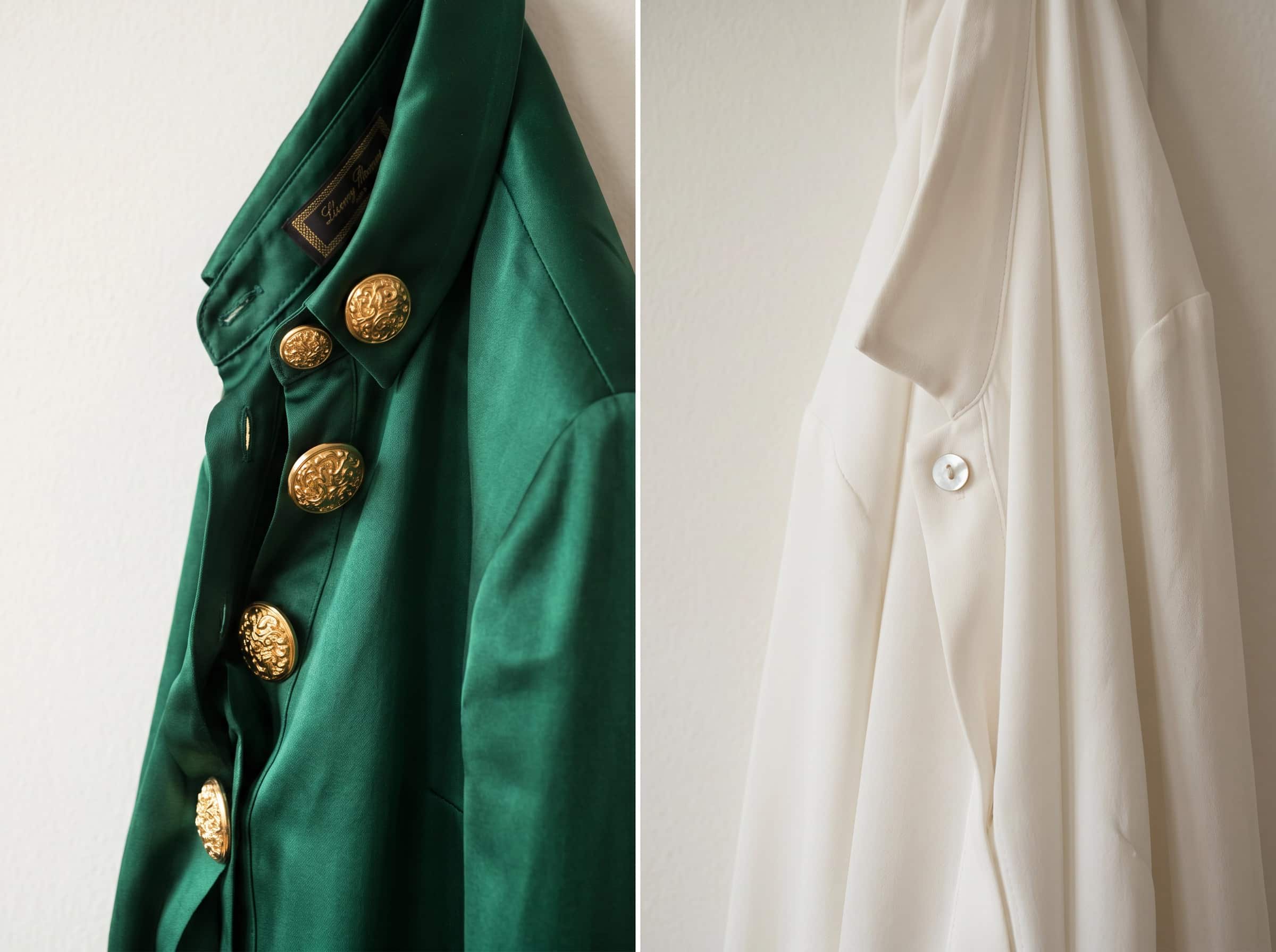
Hardware and details | Matte metal or tonal buttons, invisible zippers, clean hem finishes | Chunky gold plastic buttons, exposed zippers with no placket, loose threads |
Seam and construction | Straight, even stitching with no puckering; patterns matched at seams | Wavy seams, mismatched stripes, raw edges inside the garment |
Silhouette simplicity | Clean lines with one considered design element: a gentle puff sleeve, a soft tie, a bias cut | Too many trends fighting in one piece: ruffles, cutouts, embroidery, and a statement sleeve at once |
When a budget garment ticks the left column and avoids the right column, it will almost always look more expensive than its price tag suggests. When an expensive piece drifts into the right column, it will look cheaper than its cost no matter what the label says.
The Fabric Test I Taught Every Private Client
If you take one lesson from this post, let it be this: fabric is the single biggest predictor of how a garment will read. I used a simple three-step test during client closet edits that anyone can replicate.
First, touch the fabric and scrunch it gently in your palm. Release it. If the wrinkles fall out quickly or do not form deeply at all, the garment will look neat throughout the day. If it holds sharp creases, avoid it unless you plan to steam it constantly. Second, hold the fabric up to natural light. Can you see the outline of your hand clearly through it? Sheerness is not automatically bad, but it often signals a lower density that will lose its shape after washing. Third, look at the surface. A matte or softly brushed finish reads as natural and expensive. A shiny or slick surface almost always reads as synthetic, even if the synthetic is high-grade.
I have seen a well-chosen polyester crepe from a budget store outperform a poorly chosen silk that was too shiny and too stiff. The fabric finish, not the fiber content, determines how the eye perceives value.

Color Complexity Matters More Than You Think
In visual merchandising, we used color psychology to signal quality. Rich, complex colors — an olive with hints of brown and grey, a cream with a touch of warmth, a charcoal that looks almost blue in certain light — read as more expensive than flat, straightforward hues. Budget brands that invest in nuanced color palettes produce pieces that look far richer than brands that rely on optic white, jet black, or bright cherry red.
You can test this yourself by holding a cheap-looking grey sweater next to a more expensive-feeling one. The difference is often not the thickness of the knit, but the depth of the color. The better grey has a bit of lavender or blue buried in the fiber. The flatter grey looks like it came straight from a single dye vat. When you shop, look for colors that feel like they have layers.
Fit and Proportion Are the Great Equalizers
Nothing transforms an affordable garment like proper fit. During my e-commerce styling work, I pinned, clipped, and adjusted clothes on models constantly, even on pieces that were technically the right size. A tiny adjustment at the shoulder or a quick hem could make a forty-dollar dress look custom-made. I have written about proportion in detail elsewhere, but the core idea bears repeating here: when a piece fits your body accurately, the eye reads it as intentional and personal. Expensive clothes often come with the expectation of tailoring. Budget clothes rarely do, which is precisely why taking your affordable pieces to a tailor for small adjustments — a hem, a waist nip, a sleeve shortening — yields such dramatic results.
Real-Life Examples of Affordable Pieces That Outperform Designer Ones
Let me give you three concrete examples I have encountered firsthand in my career.
A well-known budget brand produces a mid-weight cotton crewneck tee with a clean neckline finish. I have worn it side-by-side with a designer tee that cost ten times as much. The designer version was thinner and lost its shape after two washes. The budget tee stayed opaque, held its neckline, and looked fresher for far longer. The deciding factor was fabric density and construction, not the logo.
A pair of wide-leg olive trousers from a fast fashion retailer, made in matte crepe with an elastic back waist, looked beautifully tailored on a client. They cost under thirty dollars. Next to them, a similar pair from a contemporary brand in a shiny fabric with a stiff waistband looked cheaper, simply because the sheen caught the light in an unflattering way.
A simple canvas tote from a mid-range basics brand looked more expensive than a heavily branded designer bag when photographed on set. The reason was the clean silhouette and the absence of loud logos. Quiet design always reads as more refined.
How to Shop With This Knowledge Starting Today
You can apply everything I have shared the next time you walk into a store or scroll online. Ignore the price for a moment. Look at the fabric finish. Look at the fit on the model, not just the body, but the shoulders and the hem. Look at the color: is it flat or complex? Look at the details: are the buttons quiet and the stitching even? This checklist will serve you better than any brand name ever will. I promise, because I have used it hundreds of times and it has never steered me wrong.
Final Thought: An expensive label does not guarantee an expensive look. Thoughtful design does. And thoughtful design is available at every price point, to anyone who knows what to look for.